Katie Kratzer (b. 1985) is a painter based on Mercer Island, Washington. She makes large-scale abstract paintings on raw canvas — expansive color fields and gestural mark-making built from a meditative, eyes-closed process she has developed since 2018.
Working at the intersection of somatic experience and chromatic intelligence, Kratzer approaches each painting as an act of surrender, redirecting design’s rigor toward a freedom of her own making: palette chosen from felt sensation and the subconscious residue of a rigorous color education.
Kratzer’s practice is rooted in synesthesia, through which emotion arrives as amorphous fields of color that she moves through and paints from. This perceptual framework converges with a sustained inquiry into quantum cosmology, mycorrhizal networks, and indigenous understandings of interconnection — intellectual territories she treats not as metaphor but as the animating structure of the work. She believes color carries vibrational frequency, and that a painting made from a genuine place carries that frequency into whatever room it enters.
Deeply aligned with the lineage of the 9th Street women — Mitchell, Frankenthaler, Hartigan — Kratzer’s saturated, unapologetic palette registers the full force of that inheritance while remaining entirely her own. Her paintings have been exhibited at the MIVAL gallery, in the Museum of Northwest Art annual auction, and appear in the cookbook First Generation by Frankie Gaw (Ten Speed Press, 2021). Her work is held in private residential and corporate collections. She serves on the Mercer Island Arts Council and is the mother of three young sons.
CV
Creative Experience
Sole Proprietor, Freelance Brand Design
2006–Present
NBBJ
Lead Experience Designer
Seattle, WA
2017–2018
Alaska Airlines, Senior Visual Designer
Seattle, WA
2017
Reztark Design Studio, Director of Graphic Design
Seattle, WA | Cincinnati, OH
2006–2017
Bluesky Creative, Senior Graphic Designer
Cincinnati, OH
2012–2014
Vanderbyl Design, Design Co-op
San Francisco, CA
2008, 2009
National Park Service, Design Co-op
Harpers Ferry, WV
2007, 2008
Volunteer Experience
Mercer Island Arts Council
Council Member
2025–Present
Mercer Island Visual Arts League
Member
2025–Present
Pixie Hill Preschool
President, Communications, Board Member
2024-2026
Coaching Experience
Boys and Girls Club, Little League
Mercer Island, WA
2023, 2024, 2025, 2026
Stanford University, Assistant Rowing Coach
Palo Alto, CA
2010-2012
Cincinnati Jr Rowing Club, High School Rowing Coach
Cincinnati, OH
2005–2010, 2012-2014
Pacific Rowing Club, High School Rowing Coach
San Francisco, CA
2010-2011
Awards
SEGD Global Design Merit Award
Alaska Airlines Hub HQ, 2017
Interior Design Magazine Best of Year Award, Healthcare Finalist
Kaiser Permanente WA
Exhibitions
2026
Treasures in Miniature, MIVAL Gallery, Mercer Island, WA
2025
Stellar Radiance, 34th MoNA Art Auction, Museum of Northwest Art, La Conner WA
MIVAL Holiday Show, Mercer Island Community and Events Center, Mercer Island WA
Treasures in Miniature, MIVAL Gallery, Mercer Island, WA
Education
University of Cincinnati, 2004–2010
College of Design, Art, Architecture, and Planning
BS in Graphic Design
Degree included: Drawing and painting
Multiple courses on color, shape, and line theory
Leatrice Eisman
Master Color and Design Course (in-person), 2015
Bainbridge Island, WA
High School Education included:
Drawing and Painting 1–4
Ceramics 1
Photography 1
Graphic Design 1
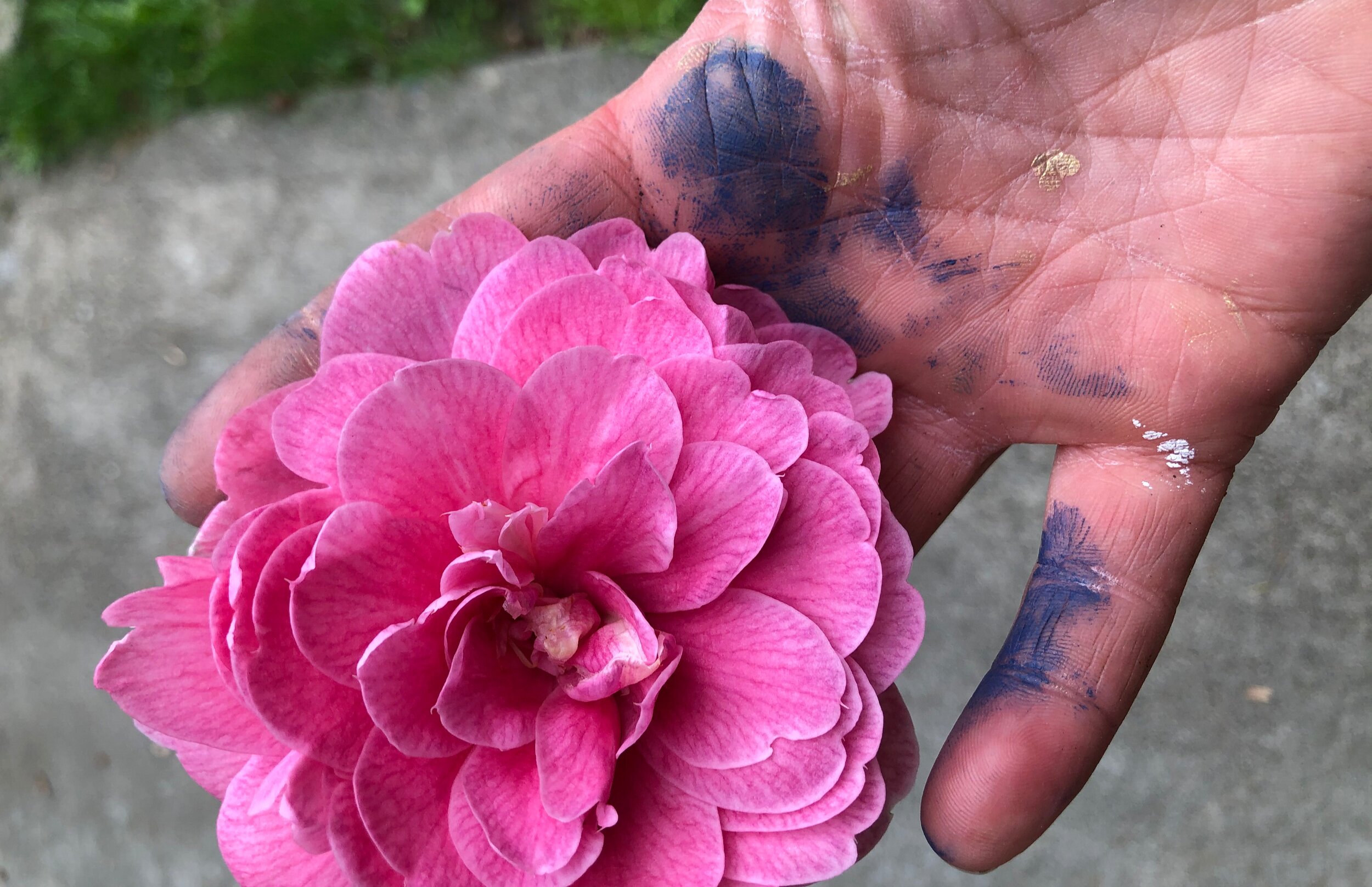
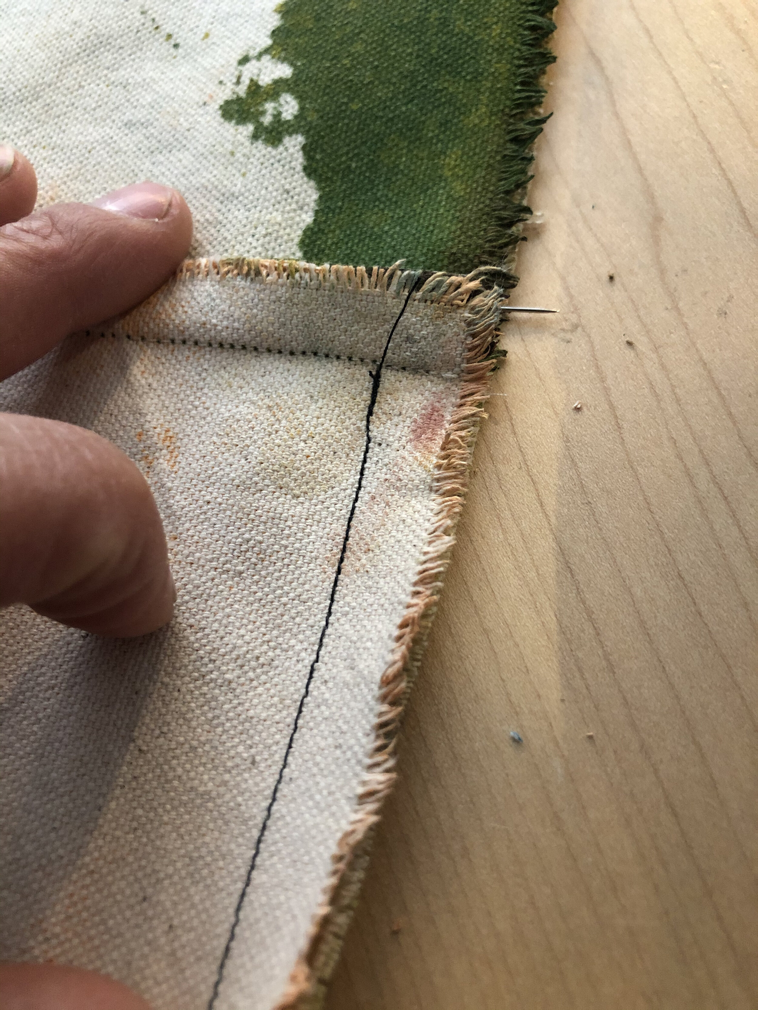
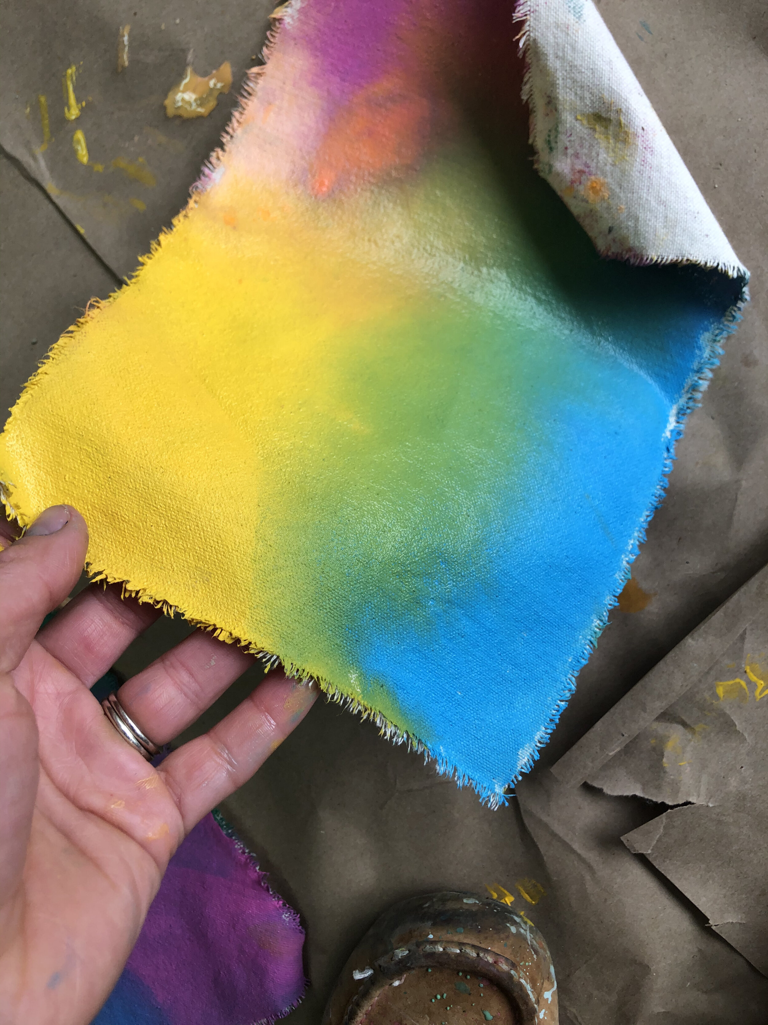
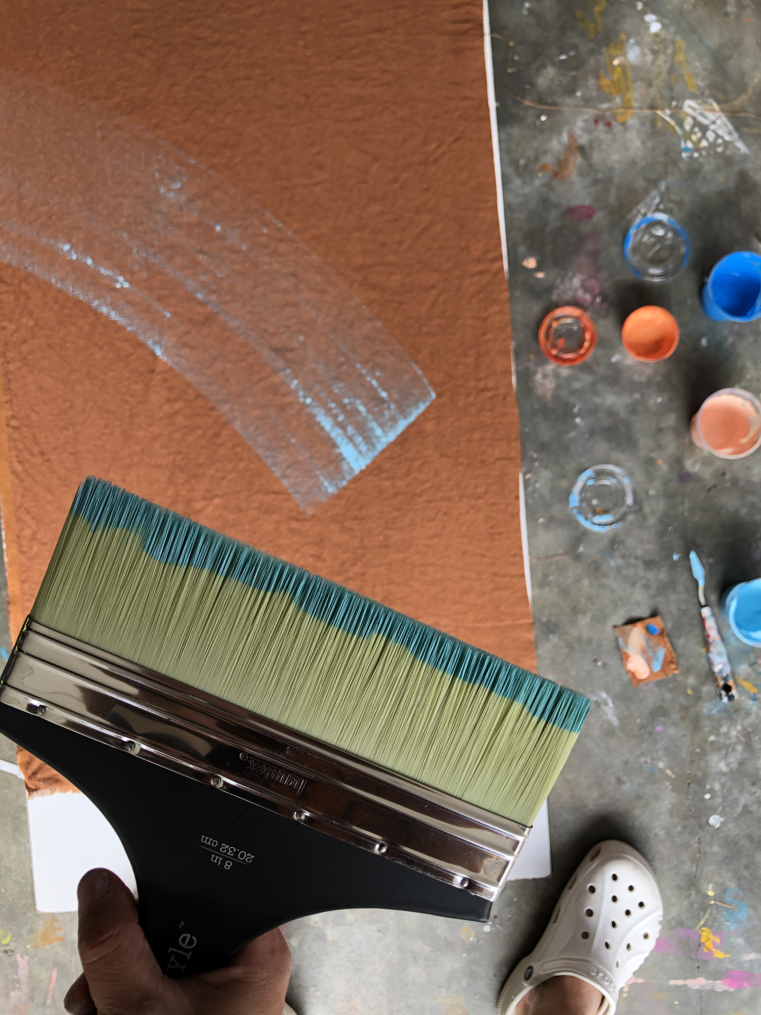
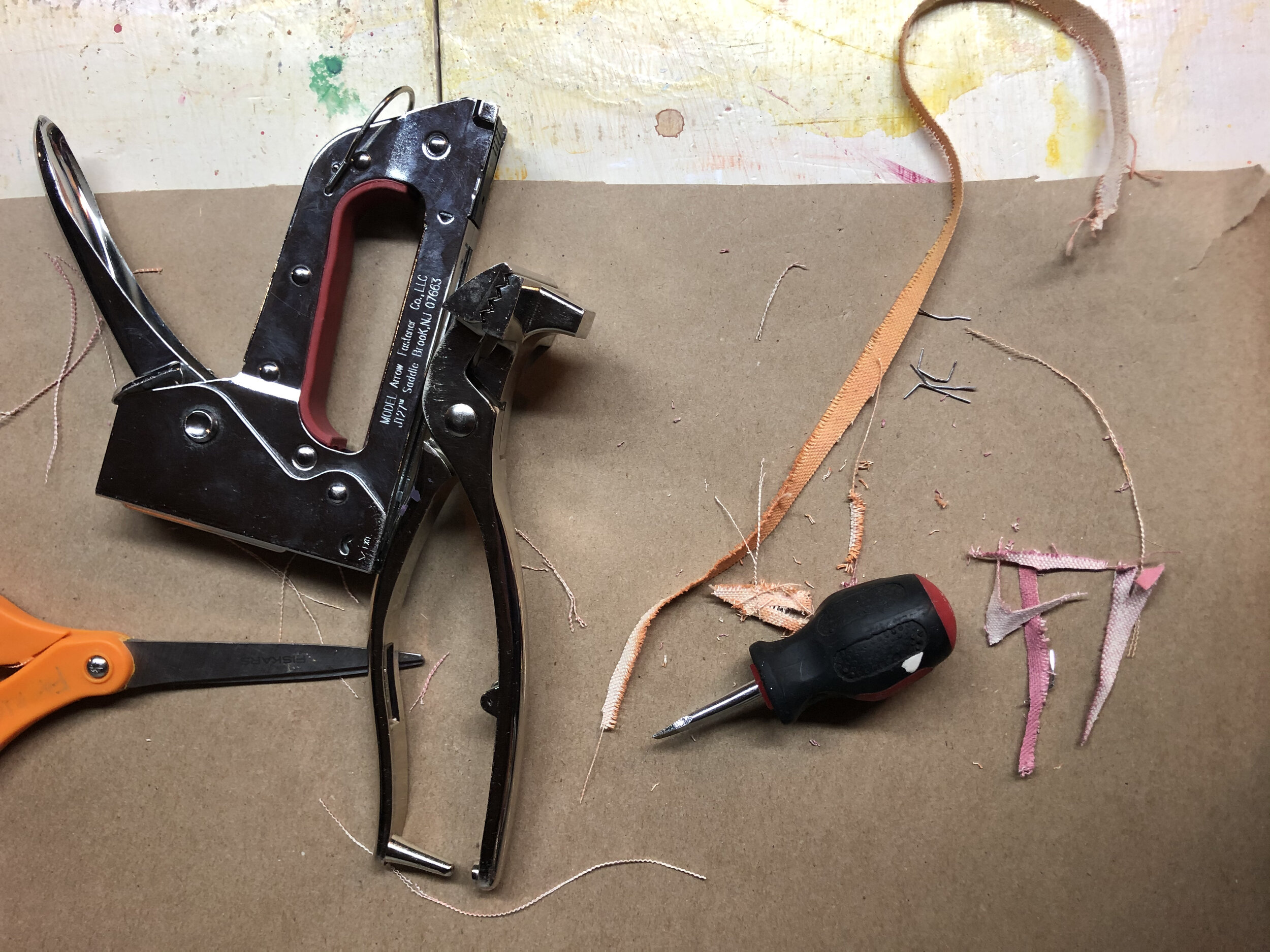
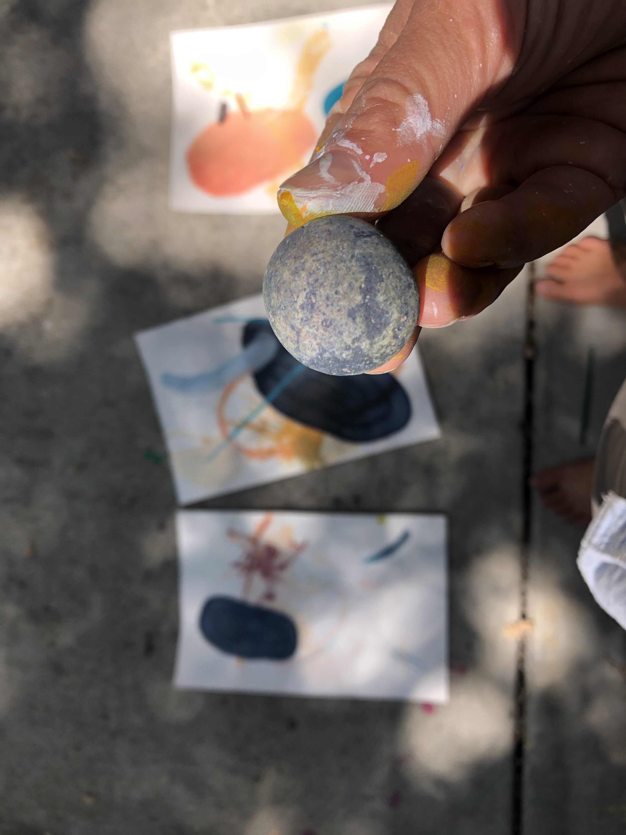
Studio and Process Photos